Bold, Colorful Spaces That Will Make You Feel Alive
While I don’t resonate with what I call, “the beige craze”, I can understand why people are scared to introduce color into their homes.
Many feel overwhelmed and mixed with emotions trying to juxtapose one color with another. Some opt into muted palettes to bring themselves some sense of relaxation. It’s true though, that colors can indeed evoke different feelings and energies, influencing our mood and perception of a space.

Kooky color explosions meet idiosyncratic art pieces in this Parisian salon, designed by Marc Valeanu (@marcvaleanu). The completed interior, an apartment he bought in 2019 in his childhood neighborhood, features collector pieces by Elizabeth Garouste and Mattia Bonetti from the 1980s and ’90s, like the armchairs and quirky chandelier. His love of the Paris design duo’s work—and interior design as an art form—can be traced back to when he was 14, working as an intern for fashion designer Christian Lacroix. The couturier’s atelier was a smorgasbord of Garouste & Bonetti’s works. “I was so young, but these wonderful pieces of pure fantasy stayed with me,” Valeanu says.
COLORS & ENERGY
Red: Red is a high-energy color associated with passion, excitement, and intensity. It can stimulate the senses and create a sense of urgency or action. In interior design, red can be used as an accent color to add drama and warmth to a space.


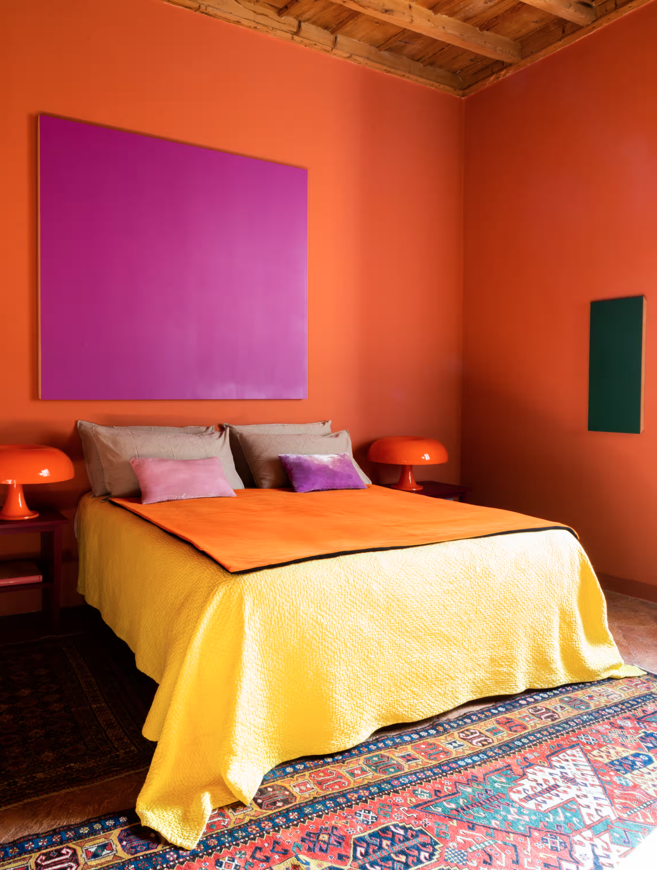
Orange: Orange combines the energy of red with the warmth of yellow. It is often associated with enthusiasm, creativity, and vitality. Orange can be used to create an inviting and energetic atmosphere, especially in areas where social interaction is encouraged.


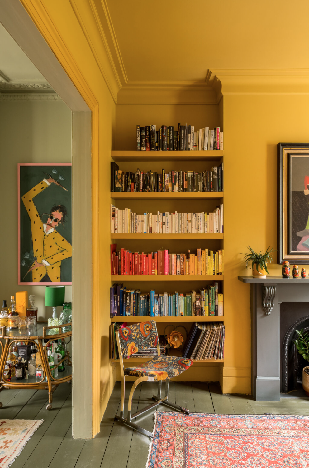
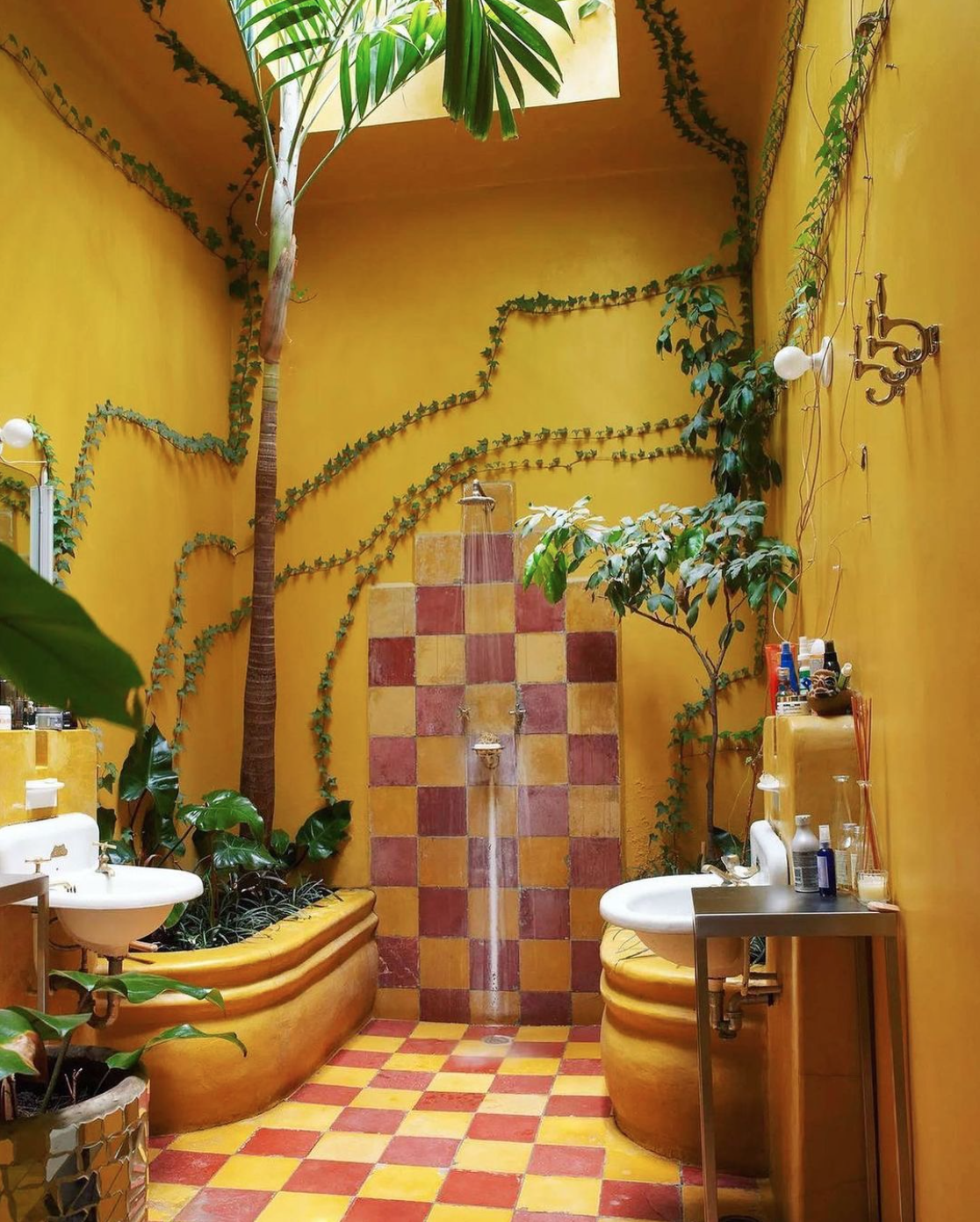
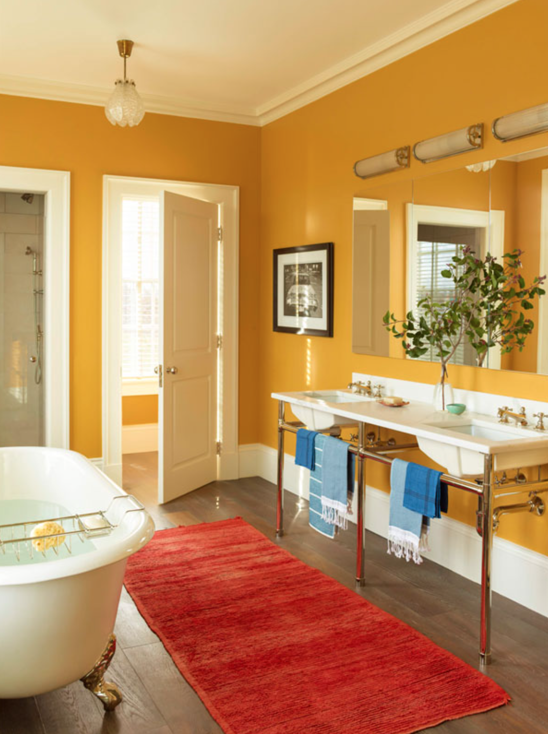
Yellow: Yellow is a bright and cheerful color that symbolizes optimism, happiness, and energy. It can create a sense of warmth and positivity in a room, making it a popular choice for kitchens, dining areas, and spaces where natural light is limited.
Green: Green is associated with nature, balance, and harmony. It has a calming and refreshing energy, making it suitable for bedrooms, living rooms, and areas where relaxation is desired. Darker shades of green can add a sense of luxury and sophistication.


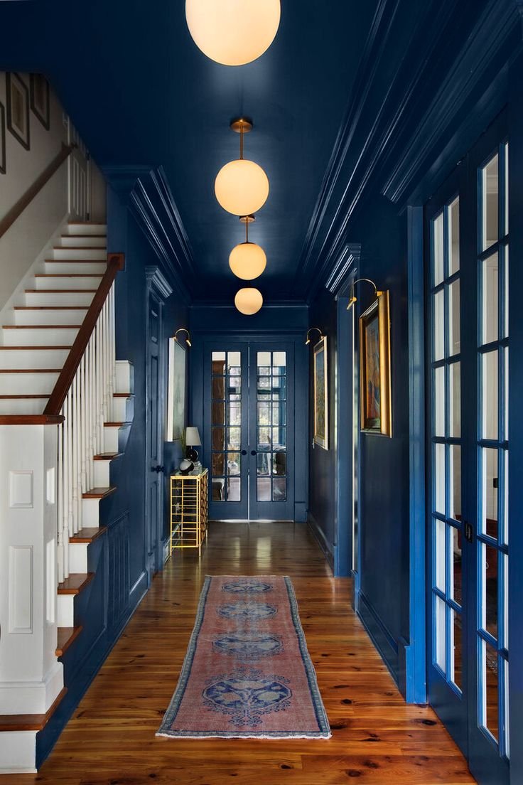
Blue: Blue is often linked to serenity, calmness, and stability. It has a cooling effect and can help create a sense of tranquility in a space. Lighter shades of blue are soothing, while deeper blues can convey a sense of depth and mystery.


Purple: Purple is associated with royalty, creativity, and spirituality. It combines the energy of red and the calmness of blue, making it a versatile color choice. Lighter shades of purple can be soothing, while vibrant purples can add a touch of luxury and drama.


Pink: Pink is often associated with femininity, romance, and playfulness. It has a gentle and soothing energy, making it suitable for bedrooms, nurseries, and spaces where a sense of comfort is desired.


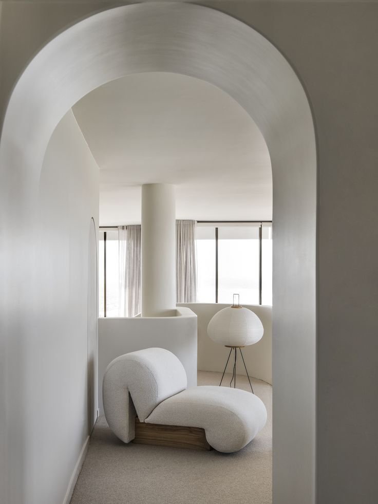
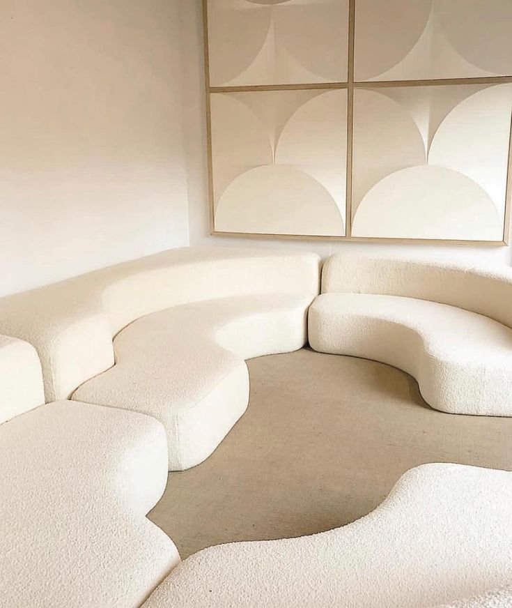
White: White is associated with purity, cleanliness, and simplicity. It reflects light and can make a space feel airy, spacious, and energized. However, too much white can sometimes feel sterile, so it's essential to balance it with other colors and textures.

Black: Black is often associated with elegance, sophistication, and power. It can add depth and contrast to a space but should be used sparingly to avoid creating a heavy or oppressive atmosphere.


When designing a space, consider the desired energy and mood you want to achieve, and use colors strategically to enhance that ambiance.
DISCLAIMER: THE MILLIE VINTAGE DOES NOT OWN ANY RIGHTS TO THESE PHOTOS. PLEASE NOTE THAT ALL IMAGES AND COPYRIGHT BELONGS TO THE ORIGINAL OWNERS. NO COPYRIGHT INFRINGEMENT INTENDED.
MORE LIKE THIS